 Trends & Reports
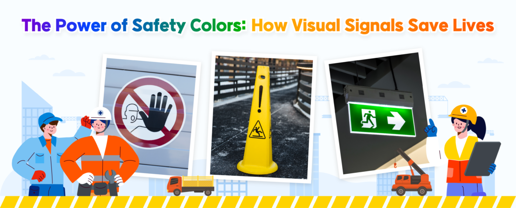
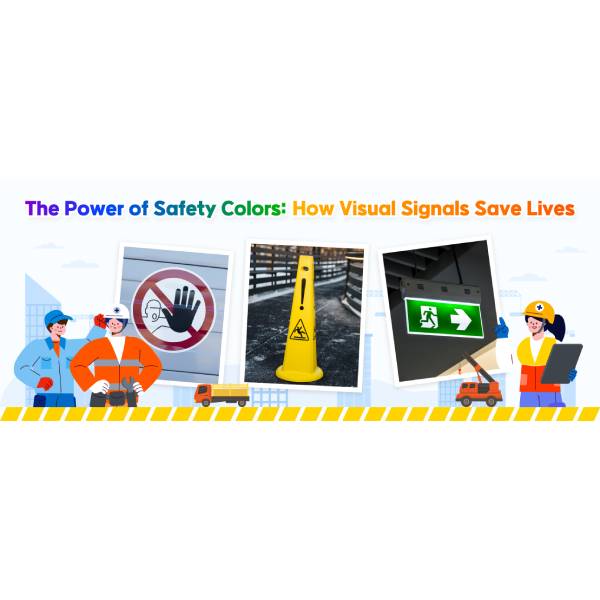
In a world where every second counts, the power of visual communication cannot be underestimated. Safety colors, often overlooked, play a crucial role in preventing accidents and saving lives. From the bright red of a stop sign to the cautionary yellow of a warning label, these colors serve as universal signals that transcend language barriers. But how are these powerful visual tools being utilized in industrial settings where worker safety is paramount?
In this article, we delve into the significance of safety colors, exploring how they function as the fastest visual language to protect and preserve human life, particularly in environments where safety cannot be compromised.
| Harnessing Safety Colors in Industrial Workspaces
The strategic application of safety colors in industrial settings is a critical component of effective communication and risk management. These colors serve as an immediate, non-verbal language that enables workers to identify hazards and safe practices at a glance. The adoption of safety colors dates back to the early 20th century, when industries began standardizing safety practices to better protect workers. Over time, these standardized colors have become a universal language that enhances workplace safety protocols.
In the United States, the American National Standards Institute (ANSI) developed the Z535 series of standards, which includes the Standards for Safety Signs and Colors. These standards specify the use of red for fire-related hazards and emergency stops, yellow for potential injury hazards, green for safety equipment and exits, blue for mandatory instructions, and orange for dangerous parts or machinery.

▲Signal word panels and examples of ANSI Z535.1-compliant three-color coding (Reference: Incompliance)
Similarly, in the United Kingdom, the Health and Safety (Safety Signs and Signals) Regulations 1996 align with the European Union’s Directive on safety signs. These regulations specify similar uses of color: red for prohibitions and fire equipment, yellow for warnings, blue for mandatory instructions, and green for safe conditions or first aid.
| Psychological Aspects of Color Perception in Safety
Colors in safety signage are strategically chosen based on their psychological impact, as they evoke specific emotional and cognitive responses. Red, associated with urgency and danger, is used for immediate hazards and emergency stops, prompting quick reactions. Yellow signals caution and high visibility, warning of potential risks like slips or trips. Green conveys safety and permission, marking safe areas and exits, while blue suggests trust and authority, used for mandatory instructions. Orange highlights moderate risks, drawing attention to dangerous machinery parts. These color associations help enhance workplace safety by effectively communicating risks and required actions.
Building on these psychological insights, industries in the UK have implemented innovative uses of color to enhance safety and operational efficiency. Since 2016, Build UK, a leading construction trade association, has implemented the Safety Helmet Colours Standards, assigning different helmet colors based on workers’ roles to clearly distinguish responsibilities and areas of work.*
* The standard does not apply to Network Rail sites, as their PPE guidelines allow only white and blue helmets on their infrastructure.
Additionally, the British Institute of Cleaning Science, developed a universal color code to support the National Patient Safety Agency’s (NPSA) National Colour Coding System. This system relied on four core colors: red, blue, green, and yellow. Red was designated for bathrooms and washrooms, blue for general areas, green for catering departments and ward kitchens, and yellow for isolation areas. The NPSA recommended that all National Health Service (NHS) facilities adopt this code as a standard practice, extending its use to healthcare facilities across the nation, from doctor’s surgeries to nursing homes.
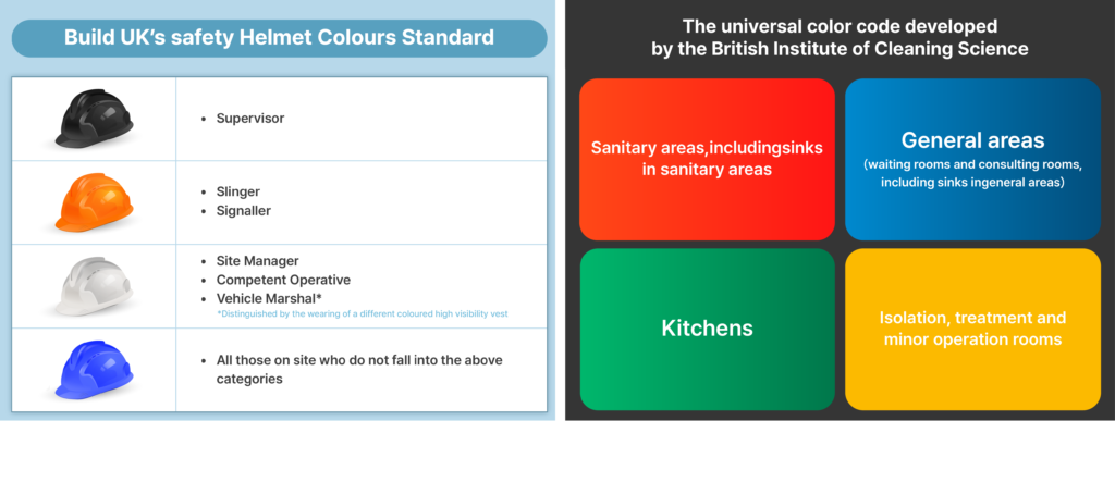
▲(Left) Build UK’s Safety Helmet Colours Standard (Reference: Build UK’s homepage) /(Right) The color coded developed by the British Institute of Cleaning Science to support the National Patient Safety Agency’s National Colour Coding System (Reference: NHS Infection Prevention and Control’s homepage)
| Enhancing Safety Through Color: The SK Innovation Ulsan Complex Experience
In South Korea, the SK Innovation Ulsan Complex (Ulsan CLX) is setting a precedent by integrating color into its safety culture. Moving beyond the monotonous grey typical of domestic manufacturing plants, Ulsan CLX, in collaboration with the Korea Occupational Safety and Health Agency and the Korea Color Universal Design Association, is using safety colors to enhance its safety culture. As part of the “Using Color to Prevent Workplace Accidents” campaign, the facility is building a safety culture through the strategic use of color and design.
The Power Plant within Ulsan CLX operates under high temperatures and pressures to produce and supply steam essential for refining and petrochemical operations, serving as an ideal site for validating the impact of safety colors and design. Starting in September last year, Ulsan CLX gathered feedback from on-site staff and developed customized designs based on expert assessments. By November, they implemented safety colors and designs on walkways, evacuation routes, stairs, and curbs within the power plant.
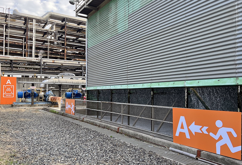
▲ Safety design and colors applied at SK Innovation’s Ulsan CLX
Following implementation, staff reported positive outcomes, noting that color-coded evacuation routes and walkways enabled more rapid responses in emergencies and allowed for immediate identification of hazards. Ulsan CLX plans to evaluate the effects of the safety design and color applications and expand this initiative across the entire complex to establish a sustainable safety culture.
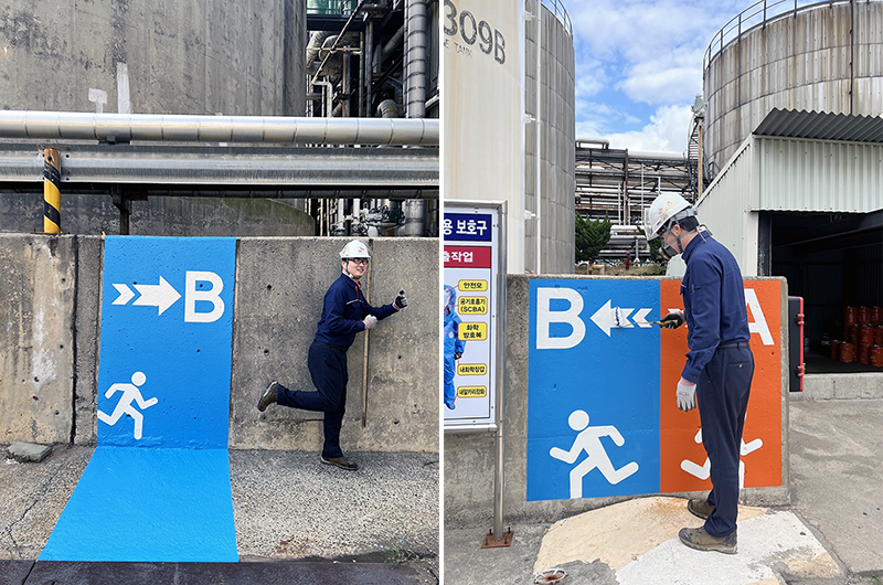
▲ Safety design and colors applied to the walkways at Ulsan CLX Power Plant, aiding intuitive understanding and immediate response from on-site personnel.
Beyond spoken language, we communicate through gestures, expressions, and other non-verbal cues. Color, too, has long stood as a powerful non-verbal means of communication. In industrial settings, the role of color is paramount—it influences behavior, prevents accidents, and enhances collaboration and productivity. By providing clear boundaries and distinctions, color introduces order and structure to the workplace, acting as a life-saving language. The transformative power of color is making industrial environments safer and more efficient every day, underscoring its vital role in fostering a culture of safety and cooperation.
– “Safety first!” – Meet SK Enterm Maritime Safety Officers, the heroes of port safety


 Youtube
 Facebook
 Instagram
 Linkedin


